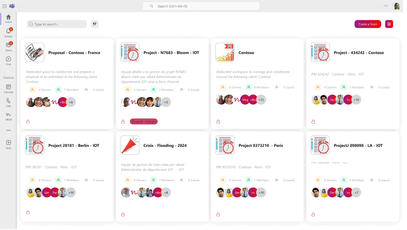
We’re excited to announce that the entire design of the app has been revamped. This new design adheres to high standards and paves the way for many new features in the future. This article details all the redesigned pages and components!
1. Discover the new design
My Teams
Designed for end-users, this section allows you to browse all your teams with improved cards showing team names, descriptions, and member avatars.
Menu
The navigation has shifted from a top tab-based system to a top-right hamburger menu. Navigate through sections like Teams, History, Templates, nFlows, Analytics, and Settings.
History
In the History section, view the team creation history and track the progress of each request.
Template
This section displays each template with a view of the apps and tabs it contains. Easily search and edit your templates.
Analytics
Access reporting and analytics on team creation and usage across all templates or a selected one.
nFlows
Connect third-party apps like Salesforce or HubSpot to your templates, automating team, channel, or conversation creation based on third-party app events. Sync membership, create teams for each deal, and more.
Settings
Manage all your settings, including the service account and delegating roles within the organization.
2. Transition timeframe
-
Starting now, users with any Admin Role can switch to the new UI.
-
From July 11th, this option will be available to all users.
-
The new UI will be the default experience later in July.
At any time, users can switch to the old UI.
For any questions or feedback, please contact us.


