Last week we shared with you our exciting news: we changed our identity and evolved into nBold.
It hasn’t been an impromptu decision: the journey from SalesTim to nBold took months of consideration and preparation. Its full realization is still underway, yet we couldn’t be more excited to present to you our transformation.
Today we invite you behind the scenes of this change and share with you the why, what, and how.
Why we decided to change our identity
The original idea
The idea to change our name came to us over a year ago. First of all, we were no longer a bot for sales in Microsoft Teams – which was the original idea behind SalesTim. Our product shifted to improving Collaboration Process and could be applied to absolutely any process that required collaboration.
Needless to say, that did create some confusion at times with potential customers who wished to address other processes that had nothing to do with sales.
So, we realized the need for a new name – one that would better reflect what we do.
How we came up with nBold
Bold
This is definitely the first word we’d use to describe our customers. They literally change the way they work, taking the way they collaborate to a more advanced level. That certainly takes some courage, determination, and, of course, boldness.
Another meaning behind bold is less obvious, but we love it just as much! Know how you emphasize the key elements of your text by making them bold? That’s what we do with our technology. All the essential content and tools that you need to collaborate with your team is right there for you – already in bold 😉
n
Considering that our technology creates an undefined number of collaboration workspaces to improve a collaboration process – the ‘n’ part refers in mathematics tor any integer number.
Also, we at nBold are tech lovers, and firstly the founders! We thought that it’s an interesting reference to link our identity to.
Our new design
Once the new name was confirmed, the work on the new design. We wanted to make sure our fresh look perfectly represented our technology so that everything we’re, is transmitted to our community.
We had the chance to meet Jonathan Da Costa whose vision and work perfectly made a perfect fit for us. He directly got the technology we’re shaping, the challenges we’re addressing, and the values that we want to communicate.
We shared with him our story, vision and personality that he translated into our new design.

Iteration, iteration, iteration
We were leaning towards bright and vibrant colors – red tones in particular, representing vigor and courage.
Below you can see the first drafts made by Jonathan Da Costa. He quickly grasped our new concept and came up with the design that reflected our personality.


Our technology allows to seamlessly integrate various tools into Microsoft Teams and, in the future, other platforms. Which is why we decided to incorporate color gradient of similar shades in our new design and logo: it communicates gradual flow and interconnection of technologies.
Here is the final result.

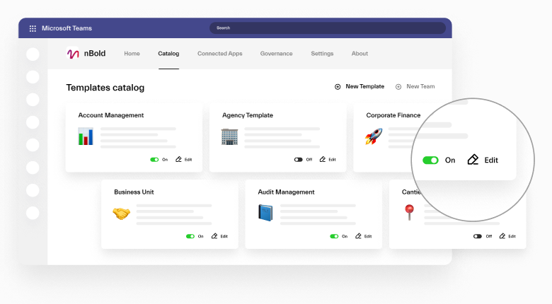
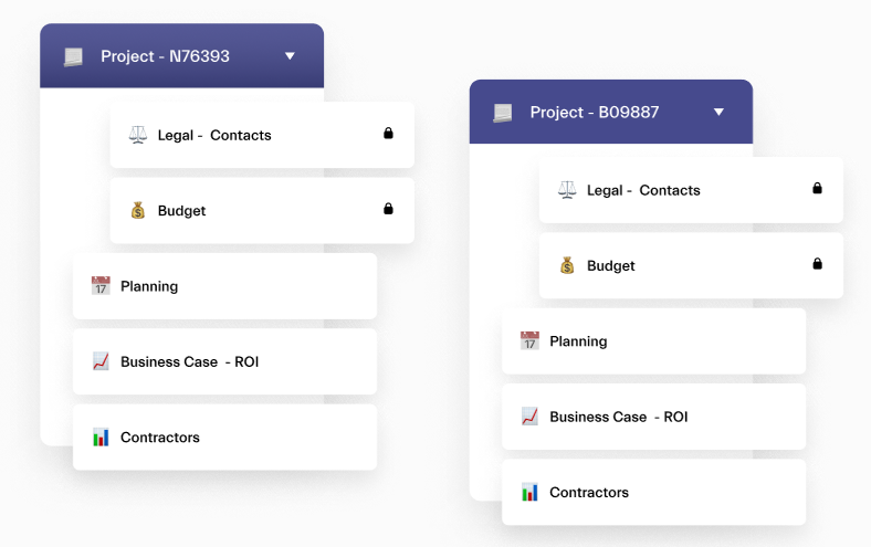
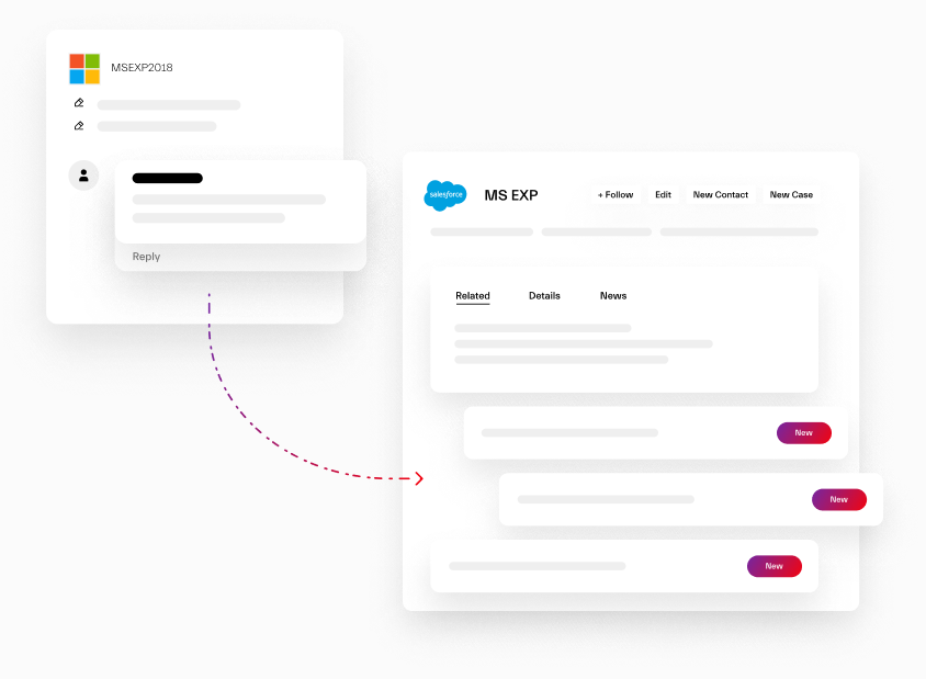
Jonathan also created illustrations that demonstrate the key capabilities of our technology.


Graphic art
Our new design communicates the main idea behind nBold – collaboration, processes, integration, fluidity. We used shape and form to conceptualize these ideas and deliver our message.

We invited the 3D designer Anoukia Perrey to put the finishing touches to the graphic work created by Jonathan. This 3D art represents the collaboration process, interconnection of technologies and teamwork.


It was a long but very exciting journey! We absolutely love your new identity and would like to give big thanks to our community who continue to support us in our bold decision 😊
A round of applause to our graphic designers Jonathan Da Costa and Anoukia Perrey for their professionalism and exceptional work.
You can explore more of their work on their Instagram pages: @by_index; @anoukiapr.
